
Cora Cohen
at Jamie Wolff
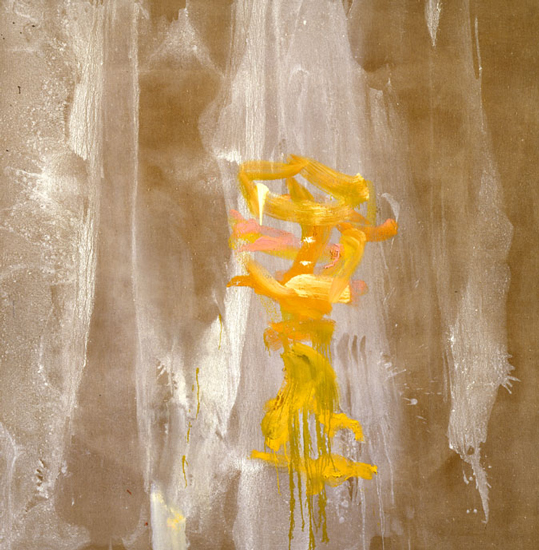
Chrism, 1988, 90x86", oil and gesso on linen
One doesn’t expect to get worked up about gestural abstraction these days and yet, if you made a list of the most interesting painters around, you would probably find that many, if not most, of them owe some fundamental debt to gestural painting even if they aren’t practicing it outright. Cora Cohen’s recent work reminds us how dynamic the real thing can be. Cohen is no newcomer to painterly abstraction – she exhibited dense, brown fields of oil-saturated brushwork at Max Hutchinson in 1984 and brighter works reminiscent of Philip Guston’s paintings of the ‘50s in subsequent group shows – but the sweeping space and dynamic control she’s developed in the intervening years is something new.
Unlike, say, Franz Kline’s, Cohen’s calligraphic bursts don’t make powerful, architectural subdivisions in the pictorial field. Instead, they float like blossoms in a deep, indefinite space. Cohen’s brushwork appears in glimpses set against or enveloped by veils of highly diluted matte black or white washes. These veils provide a sense of grand scale. They’re like the billowing draperies that adorn floor-to-ceiling windows in palace salons.
It’s hard to say why Cohen’s work is so much more interesting than that of other pour, splash, and spread painters (Olitski, Banard, et al.). Perhaps it’s because her pouring is freer and less self-conscious than theirs; the flow of her washes ignores the edges of the canvas rather than cuddling up to them. Also her use of black-and-white washes over the light or dark grounds of canvas or linen generates a kind of glare, like film-noir backlighting, an effect that’s starker and tougher than the calibrated color modulations of those who follow the Greenbergian formalist line. Cohen’s hint of chiaroscuro restores the drama and urbanity of black and white to gestural abstraction.